Table of Content
With one of the oldest and most remarkable histories in the motorcycling world, Harley Davidson has become more than just a brand, it has become a lifestyle for Americans. If you own a Harley Davidson motorcycle, you have unlocked an achievement. The brand has become a giant global entity synonymous with class, quality, and success.
Several motorcycle manufacturers attempted to impersonate Harley Davidson motorcycles in the past but failed to gain public attention and love as they were not carrying the Harley Davidson logo and emblem.
Apart from the sheer class, authentic build, unmatched performance, and classic styling of H-D motorcycles, the original Harley Davidson logo and emblems are worth millions of dollars. Though the Harley Davidson logo has evolved several times throughout the years, the concept and wisdom behind them have stayed the same. Continue reading this article to learn in detail about the Harley Davidson logo's evolution and history.
1. Harley Davidson Logo History
Before you get into the design and the idea behind the Harley Davidson old logo, there is a fact that you must know. While the Harley Davidson was established as a motorcycle brand in 1903, the first and original Harley-Davidson logo came out in 1910.
According to certain sources, the efforts behind the Harley Davidson logo were majorly put by Janet Davidson, the Davidson Brothers’ aunt. Aunt Janet was also responsible for the pinstriping and crafting of the Harley Davidson name on the original H-D bicycles. Besides being a notable figure in the Harley Davidson history, she is said to be the first-ever woman rider to ride a Harley motorbike.
No-Follow Link
2. Harley Davidson Logo Evolution
Harley Davidson is a well-known American motorcycle brand and is a favorite for many riders around the world for various reasons. Those who are familiar with the term motorcycling must have heard about this iconic brand.
It makes you a die-hard Harley fan if you are familiar with what the original Harley Davidson logo looks like. The Harley Davidson logo history is very old and the logo design has been modified several times throughout the years. Let’s learn about the Harley Davidson logo evolution since it was first introduced and displayed on Harley motorcycles.
Harley-Davidson Logos By Year
2.1 1910-1953: The Original H-D Bar and Shield Logo

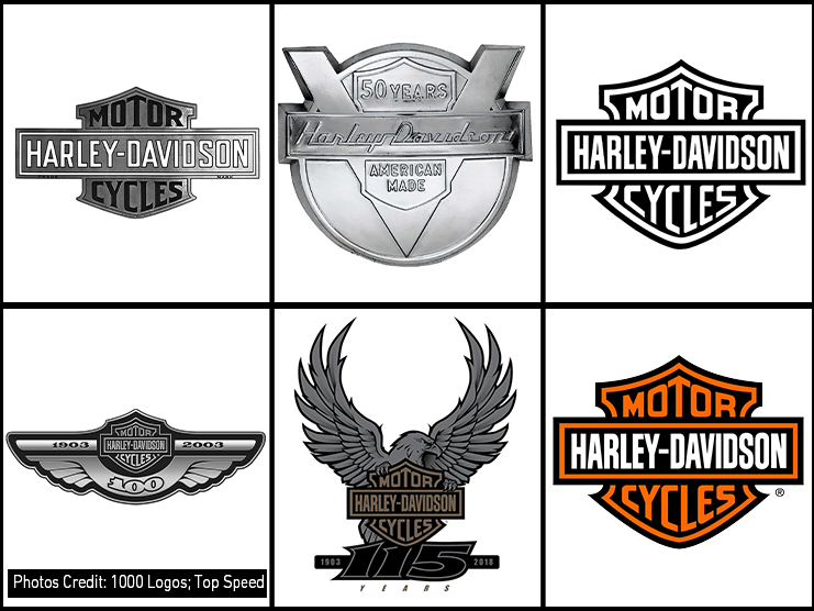
As you can expect from a logo established at that time, it was a mixture of gray, black, and white colors and carried a bar and shield. The “HARLEY-DAVIDSON” font was engraved on the bar, along with the white borders, and was placed horizontally on top of the shield with black borders and “MOTORCYCLES” mentioned on it.
As the brand describes, the Harley Davidson logo represents individuality and freedom which is true in every sense as each Harley model is designed to support customization so riders can give their Harley a personalized touch. Above all, Harley-Davidson motorbikes promise freedom to riders with their long-haul riding capabilities.
The bar on the Harley Davidson logo symbolizes stability and strength. Meanwhile, the shield signifies safety and protection. Though the Harley Davidson logo has evolved several times over the years, the spirit has stayed the same.
2.2 1929: Harley Davidson Eagle Logo

With the advent of the Great Depression era in 1929, Harley Davidson sales started getting down and it was the worst economic downfall the world ever faced. To fight this abrupt sales decline, Harley Davidson cleverly redesigned its logo and introduced the eagle along with the bar and shield H-D logo design.
What Does the Eagle Represent in Harley-Davidson?
The eagle is the national bird of America and the new H-D eagle logo became a national emblem because it signifies courage, liberty, and independence. To register itself as the national motorcycle brand of America, Harley Davidson started using the bald eagle logo to pay tribute to the U.S. Army, Marine, and Air Force.
For Harley Davidson, the inclusion of a bald eagle in the H-D logo also promotes the concept of freedom, strength, and open road pursuit. It perfectly fits the Harley Davidson Moto and brand strategy as the company’s major production line is based on cruisers and touring bikes, built to conquer open roads.
Bald Eagle to Screamin’ Eagle
To make “Eagle” an integral part of the Harley-Davidson family, the company spun off the Screamin’ Eagle brand to produce the performance parts and technology for H-D models. Screamin’ Eagles is dedicated to assisting the Harley Davidson factory team in multiple track racing events with its superior performance accessories.
1930
There was a few changes made to the Harley Davidson logo in 1930. The letter “O” in the bar and shield H-D logo received the red and yellow palette.
1933
In 1933, the colors were changed to black and orange, the same colors that are used in the Harley-Davidson current logo. There is a theory behind using these colors in the Harley Davidson logo which tells that the orange represents youth and ingenuity, while the yellow depicts liveliness and contentment.
2.3 The Very Famous Harley Davidson Skull Logo

The Harley Davidson skull logo is one of the most mysterious, yet popular logos and emblems widely used on H-D bikes. Though it was unofficial, it still became quite prominent in the early 1930s after a group of bikers became predominantly known as “Outlaws”.
There is vivid information regarding the skull logo used on Harley Davidson bikes and the company has also avoided the question regarding the origin of this logo. However, it was widely adopted by the brand as it became the greatest buzz of its time. Even today, you will find the skull logo/emblem on different motorcycle parts in the Willie G Skull Black Collection by Harley Davidson.
The Harley Davidson skull logo became widely known as the “Willie G Skull Chrome”, after the name of Willie G. Davidson, the former senior vice president and chief styling officer of Harley Davidson. Willie was also the grandson of the company’s co-founder, William A. Davidson.
To restore the tarnished image created by the outlaws, Willie G. Davidson came up with the idea to blend the skull and eagle logo.
1949
To ensure a rugged and manly vibe, Harley Davidson gave its bar and shield logo a complete metallic design and touch.
2.4 1953-1965: The V-Shaped 50th Anniversary H-D Logo

The complete redesign of the Harley-Davidson old logo was made in 1953. The shield received a little less space and limelight on the logo and new elements were added to celebrate the 50th anniversary of the brand. The trademark of this new H-D logo was the “V” engraved in the center with both ends emerging out of the circle base. The “V” in the logo represents the Harley-Davidson’s heritage of V-Twin engines used to power its motorcycles.
The bar was kept on top of the logo design with “Harley-Davidson” written in a modern font. The shield was engraved between the large “V” with a “50 YEARS” font in all caps on the upper half and the “AMERICAN MADE” font in all caps on the lower half of the shield, divided by the bar.
This new H-D logo received a lot of appreciation from Harley-Davidson fans as the V-Twin engine became an integral part of Harley motorcycles. All Harley motorcycles manufactured from 1953 to 1965 proudly carried this metal badge logo as a medallion.
2.5 1965-2003: The Modernized Old H-D Logo

The Harley Davidson logo was redesigned and brought back to its original shape in 1965 with a bit of a modernized touch. The bar and shield were in the same pattern as the old Harley-Davidson logo with “HARLEY-DAVIDSON” font written on the bar in white font on a black base. Meanwhile, the “MOTOR CYCLES” was also copied and pasted in white font on a black base. The bar and shield in the H-D logo also had white boundaries.
Harley riders readily accepted the bar and shield Harley logo with this modernized monochrome touch and it marked a new chapter in the Harley Davidson’s iconic history.
2.6 2003: The 100th Anniversary Harley-Davidson Logo

To celebrate the brand’s 100th anniversary of completing a decade of manufacturing motorcycles that are close to the hearts of almost every American, Harley Davidson introduced a special logo in 2003.
To keep the original spirit alive in the new logo, Harley Davidson kept the bar and shield in the top center, along with the addition of the two wide wings, symbolizing freedom, bravery, and speed. The 100th Anniversary H-D logo had a black base and the rest of the objects, design, and boundary received a chrome treatment.
There are two bars on either side of the bar and shield design, parallel to the edges of the wings. The left bar has “1903” and the right bar has “2003” inscribed on it, along with a “100” inscription below the bar and shield design on the logo.
The wings design on the 100th Anniversary logo is a representation of the Harley Davidson Heritage and is inspired by the Eagle Harley logo of the 1930s.
2.7 2008: 105th Anniversary Harley Davidson Logo

As the strategy worked in 2003, Harley-Davidson decided to redesign its brand’s logo in 2008 after completing 105 years. It was a modified version and idea of the previous 100th Anniversary H-D logo, containing the same elements. The orange-colored bar and shield Harley logo were moved to the lower center and wide upward wing designs originating from the bar and shield. All of this design was placed on a circular black base with chrome borders. The “105 Years” inscription was engraved on top of the bar and shield H-D logo between the wings. Meanwhile the “1903” and “2008” were engraved on the chrome border with a star at the bottom center.
2.8 2018: 115th Anniversary Harley Davidson Logo

The 115th Anniversary Harley Davidson logo once again brought the bald eagle back in 2018 and this time, the eagle is holding the main H-D bar and shield logo with its claws. The bar and shield design remains in the center and the eagle with its wings wide open pointing upwards in the background. The large “115” font is positioned right below the bar and shield, along with the “1903” on its left and “2018” on its right. The “Years” is inscribed on the extreme bottom of the logo, below the “115” font.
2.9 Present: The Harley Davidson Current Logo

The present Harley Davidson logo is the same as the very first logo of 1910 but is a modernized and colored version. It has a black base and orange borders for both the bar and shield. The text on the shield which says “MOTOR CYCLES” is also in orange. Meanwhile, the “HARLEY-DAVIDSON” font on the bar is white, making the brand name quite prominent.
The color combination and the style of the Harley Davidson logo portray a vibrant and attention-grabbing look that fits perfectly for the merchandising and branding campaigns. The Harley Davidson logo carries a proud heritage with its bar and shield design since its establishment in 1910 and depicts several characteristics, including warmth, energy, freedom, creativity, and optimism.
3. Wrap-Up
Harley Davidson logos have always created a spark among the motorcycling community and whenever the logo was evolved, it embedded a special meaning. Though the Harley Davidson logo has evolved several times since it was first registered in 1910, the idea and meaning behind it have remained the same to a certain extent.
Owing to the specific circumstances, Harley has brought new elements throughout the logo evolution, including the bald eagle, large “V”, wide wings, and skull. However, the bar and shield design has stayed consistent with the Harley Davidson logo throughout its evolution.
Overall, the Harley Davidson logo has always succeeded in portraying the nationalist and patriotic image of the brand which is true in every sense. Other than that, it also signifies freedom, strength, stability, and pursuit.
4. Get Your Old Harley Customized
Doesn’t matter which Harley you ride and how old the logo is on your bike, if you are a proud owner, you can always ride your classic Harley alongside the modern cruisers and touring bikes. Want to keep your Harley ready for long-mile adventures and ride on never-ending open roads? Viking Bags is always there for a complete makeover of your Harley.
The company makes the finest-quality motorcycle saddlebags , tour packs , backpacks , tank bags , and sissy bar bags to improve the luggage carrying capacity of your Harley. Other than that, you can also customize the ergonomic and comfort level of your bike to suit your needs and riding style with the help of a range of motorcycle parts, including new seats , handlebars , sissy bars , luggage racks , crash bars , fairings , and backrests .


Leave a comment
All comments are moderated before being published.
This site is protected by hCaptcha and the hCaptcha Privacy Policy and Terms of Service apply.