Table of Content
Ohlins is a Swedish brand in the auto industry, especially in the racing world. The brand has made a big step today. The best and the giant suspension company unveiled its new logo to the world. This is not just a simple change of color scheme; it is a new shape, form, aim, and a new dawn of one of the most renowned brands in racing, high-speed vehicles, and bikes. The press release says:
“Today marks the dawn of a new era for Öhlins. Debuting a new visual identity, the Swedish suspension brand and global racing icon moves boldly into the future while honouring its past.”
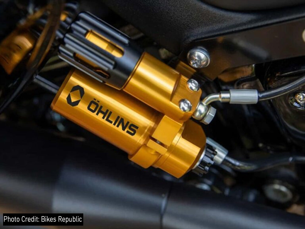
For the past 5 decades, Ohlins has been the best choice of riders and racers, seeking the best. Their gold-finished shocks are well-known around the world. The brand is now undertaking radical changes to the global perception of the Ohlins brand. Despite the changes made, the gold color that brought the brand fame will remain where it is.
1. What’s New in the Ohlins Brand?
The new logo shows the extent to which Ohlins is concerned about the future. The brand removed the two dots on the letter ‘O’. They are known as ‘Umlauts’, and they made the former logo hard to type on phones and in web pages. The new look is smooth and clean. It is compatible with screens and phones everywhere around the world.
The most crucial change is the new visual symbol. Two acute angles are now in the form of a diamond. This new symbol is in the place of the old ‘O’. It conveys a message: Ohlins is about growth, new ideas, and speed. The arrows depict progressive growth towards the future. The diamond shape in the new look shows accuracy and robustness. These are the key values at Ohlins Performance Suspension. The brand uses this visual identity to communicate to people that it is prepared to face whatever comes next.
2. Why Did Ohlins Make These Changes?

Mark Spelthaen is the manager of the Ohlins Group. According to him, the old look of the brand was not equal to the speed at which they were advancing in tech. He added:
“Over the past 50 years, Öhlins has built a brand synonymous with racing excellence and cutting-edge suspension technology. While we have strived to remain at the forefront of high-performance, premium suspension, the visual representation of our brand has not evolved at the same pace. As we enter this exciting new era for Öhlins, our new visual identity positions us to continue our legacy into the future. It reflects the forward-looking, innovative spirit at the core of our brand while opening new opportunities to connect with and inspire enthusiasts.”
The Ohlins brand has tried to address the issue with the new logo design. Ohlins reached out to people who are somehow linked with the brand. Youngster bike lovers and car fans were also contacted who prefer the latest designs and intelligent tech.
The global launch of the new Ohlins logo was made at the EICMA show. The latest global visual image of Ohlins was displayed at the great bike exhibition in Milan. This rebranding is a new beginning for the Swedish giant suspension brand. All these rebranding ideas came after Brembo, another massive Italian auto parts maker specializing in braking equipment, took charge of Ohlins in early 2025. This is a type of union that brought the braking and shocks giants in one place.
3. The Gold Finish Remains There on Ohlins Shocks
This is what fans want to know: Is the gold still there? Yes! The legendary gold and yellow, which make Ohlins shocks easily recognizable, will not go anywhere. The gold finish is now combined with black, white, blue, and gray shades. This combination makes the past alive, and it is taking us all into the future.
The new visual identity of Ohlins pays tribute and respect to half a century of the brand’s success. The previous font still reminds us of the Ohlins’ origin. Yet, it is now leaner and modern. This old and new combination demonstrated the heart of the brand while celebrating the past, but running into the future.
4. What The New Ohlins’ Logo Means for Riders
This rebranding is positive news for riders. It implies that Ohlins will continue to stretch the boundaries of suspension tech. The new look shows that the brand is willing to continue to lead the auto industry. They intend to deliver more tech to the auto enthusiasts.
Ohlins passes this next stage with pride. This top-end, giant suspension brand has the same objectives as it did fifty years ago. However, now the new logo informs the world that it is built for speed, designed with precision, and aimed towards the future.


Leave a comment
All comments are moderated before being published.
This site is protected by hCaptcha and the hCaptcha Privacy Policy and Terms of Service apply.